Cavita Restaurant
Ground floor Wigmore Street, London
Completed and opened in June 2022
Design by COR London.
90 covers including two terraces, restaurant and bar seating.
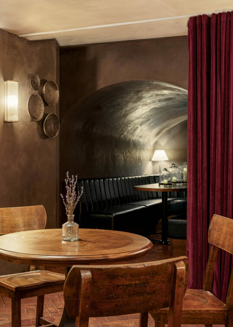
Mayahuel Mecaleria Bar
Lower ground foor Wigmore Street, London
completed and opening in July 2022 by COR London.
55 covers including six tables of four, bar and counter seating, and two vault booth seating.
Brazilian born Camila Rodrigues was first approached by Basit Nasim, the co-founder and creative heart of restaurant brands Chuck Burgers, Chingón and Hotbox, to then be introduced to the other two founder directors of Cavita.
There was an immediate sense of connection and understanding of their design goals. Although the brief was one single line; it should feel like you are in a Mexican granny’s backyard – I understood straight away what it would take to get there.
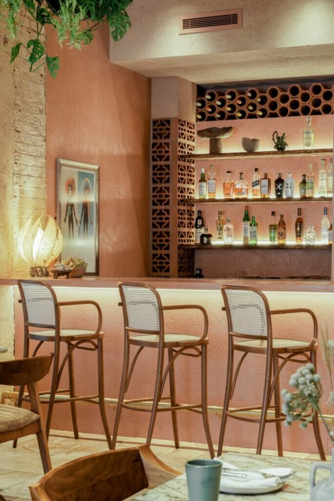
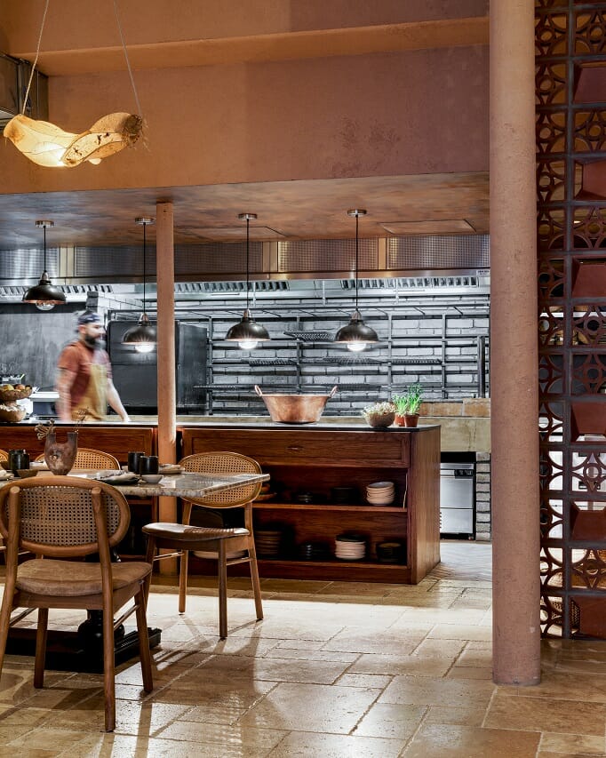
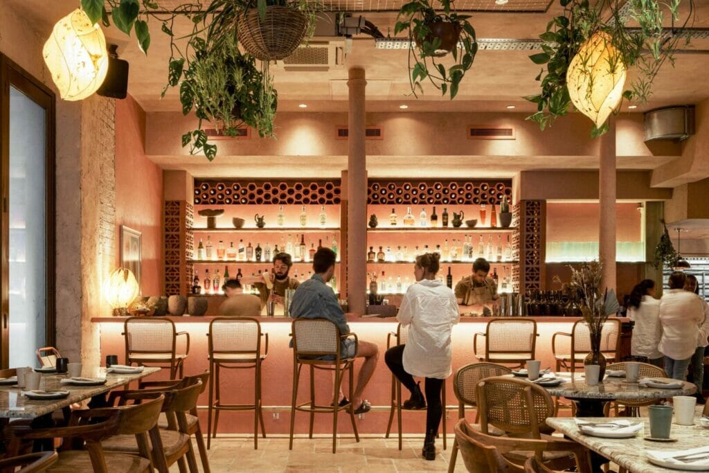
From the start, I dived into in-depth research of Mexican materials, traditions and colours. I knew that Cavita had to look under-designed, welcoming, and lived-in while feeling unique and sophisticated due to its Central London location. The search for suitable materials and suppliers was extensive; they had to be as sustainable as possible, with products that bring the beauty of natural materials while looking exceptional. For instance, the brick lights on the internal walls, although they look at first like a small detail, were designed to integrate the building’s history and aesthetic, keeping the ‘under-designed’ theme whilst providing just an extra warmth to the guests. The room dividers and bar columns were inspired by traditional Mexican architecture and extruded bricks; these hollow bricks are commonly used in tropical countries to provide extra natural light and ventilation and were the ideal choice for Cavita. The supplier we reached out to, an Indian goods producer that had never imported to Britain, was initially not so confident about delivering the items all in one piece, all the way to us in London. After a few exchanges, we settled on the appropriate courier and packaging and commissioned them for both the bricks and the wall lights. Interestingly, the Mexican chef also has a distant Indian ancestry, so we also wanted to bring a bit of that side to the design.
The bar is the centre-piece of Cavita’s experience. With six authentic cocktails and a large selection of Mezcals and Tequilas, it plays a significant role in bringing that Mexican atmosphere out and activating the guest’s senses. When I met the chef for the first time, I understood the bar was greatly important for her; most bars have a virile impression to it, and for once, this had to be the opposite. With its pink and terracotta walls, textured counter, and warm lights, Cavita’s bar is a showcase of femininity.
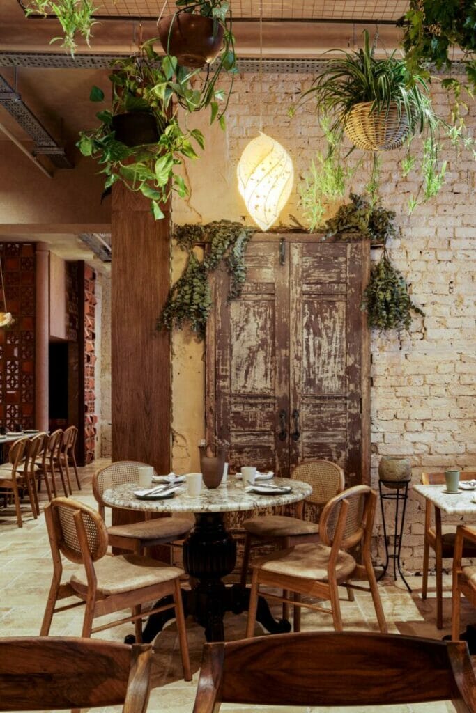
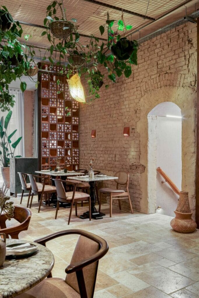
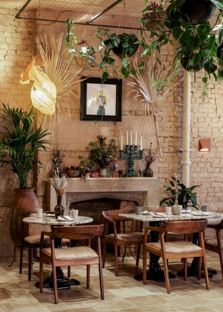
The wonderfully playful and delicate paper lamps also had their logistic challenges but were fundamental to bringing more feminity to the space. When we first came across KA Iluminacion, a small producer in Oaxaca, we were amazed by their work and instantly sought to commission them to create Cavita’s lamps. Their paper lamps go through a delicate and respectful process. They are made of falling flowers picked from the ground near the trees they fall from. The eight different lamp designs represent some of the chef’s meaningful things, for instance, the heart tattoo on her arm, cocoa fruit, and the agave plant.
Another focal point in the restaurant is the beautiful Altar de los Muertos. The Day of the Dead is a very important Mexican tradition where they create an offering altar to honour their loved ones who have died. We created this celebratory moment over a reclaimed composite stone fireplace mantle we added to the building’s original chimney breast, which can already be called a sensation within the guests.
The furniture selection came in to bring more sophistication and cosiness to the space. With solid walnut and leather cushioned chairs, we mix-and-match three different seating designs that also included caned back chairs and bar stools. To complement the granite table-tops, we used two types of black table bases that add beautiful detailing to the scheme.
The kitchen and heart of the restaurant had to be open and inviting and needed to be like when you are at your granny’s house, and you can sit and talk to her while she cooks. Although the kitchen fabrication was outsourced, we selected the gorgeous, reclaimed bricks that house the Country Fire Kitchen barbecue and highly textural Acid Stain finish to the microcemented walls and ceiling. The bespoke chef’s table is designed with the Mexican detailing in mind and a contemporary twist; it also includes open shelves to display the delicate plates, cups and bowls by Mexican potter based in London, Lucia Ocejo.
To bring that village and outdoor feeling throughout, we designed oversized weathered stone sinks for the bathrooms, which you typically see in Mexican gardens. Our supplier is known to have strong ancestral know-how and ancient stone-cutting technique. Their mission was to produce these sinks to be durable, resistant to the long journey, and look just like our drawings. Each Estaillades limestone sink weights 350 kilos and is a perfect addition to the men’s and ladies’ toilets, but getting them into position was a challenge.
To reach the bathrooms though, you will have to go through what I call the cavernous corridor. Once we exposed the building’s original walls, I was instantly attracted to the interesting pattern created by different mortars from different times and ages that were uncovered in this corridor. To complement it, we applied a brown and ebony acid stain to the opposite wall and finished by adding directional downlights highlighting these features.
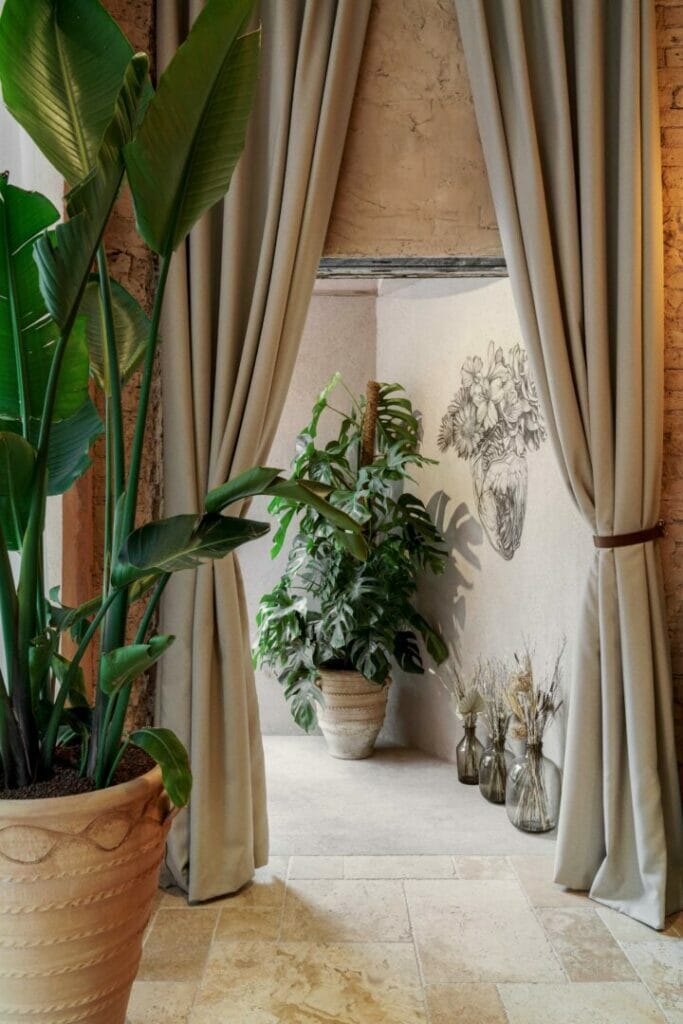
However, the most significant design decision has to be the mezcaleria vaults. The property has a total of 5 original burials at the back of the building, which were hidden for many years and only accessible by one staff door. As soon as I was made aware of it, I knew we had to incorporate them into the cave-like speak-easy Mayahuel bar. The directors were initially conservative about how this could delay the entire process and opening. At first, we also weren’t sure if the divider wall was structural or not, and the vaults hadn’t been looked after for so many years. Nevertheless, after a little time, the directors were convinced this was the right thing to do, and we incorporated two of the vaults, which will be used for private dinners and events which can be screened off by luxurious velvet curtains.
The mezcalerias back in Mexico have a man-cave feel; they are usually small, rustic and dark and are found in the country’s traditional villages. Mayahuel mezcaleria, on the other hand, has a mix of that same rough ambience, and the sophistication is brought through the lighting, booth seating, velvet curtains and vintage accessories. Alongside the vaults, its bespoke bar is the central point with a solid wood worktop and split-face travertine noce (a type of travertine) cut in mitre and brought from Rome.
Throughout the whole space, we designed several bespoke items, such as the two bars, the chef’s kitchen table, cloakroom, granite table-tops, and others. Still, we also integrated over thirty different second-hand antique pieces into the design. We also brought countless items and accessories from Mexico with the help of the chef’s mother. Three walls showcase wall arts plus various other handmade prints by Ivan Salamanca, a Mexican tattoo artist that we flew from Mexico City. The whole of the restaurant is embraced by a ceiling garden to optimise the floor space. These plants were all selected in collaboration with Conservatory Archives to soften the ceiling space and create an outdoor feel and look indoors. The plant’s grids were designed by us, with a stepped detail at the entrance for a more welcoming feeling.
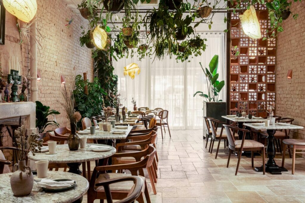
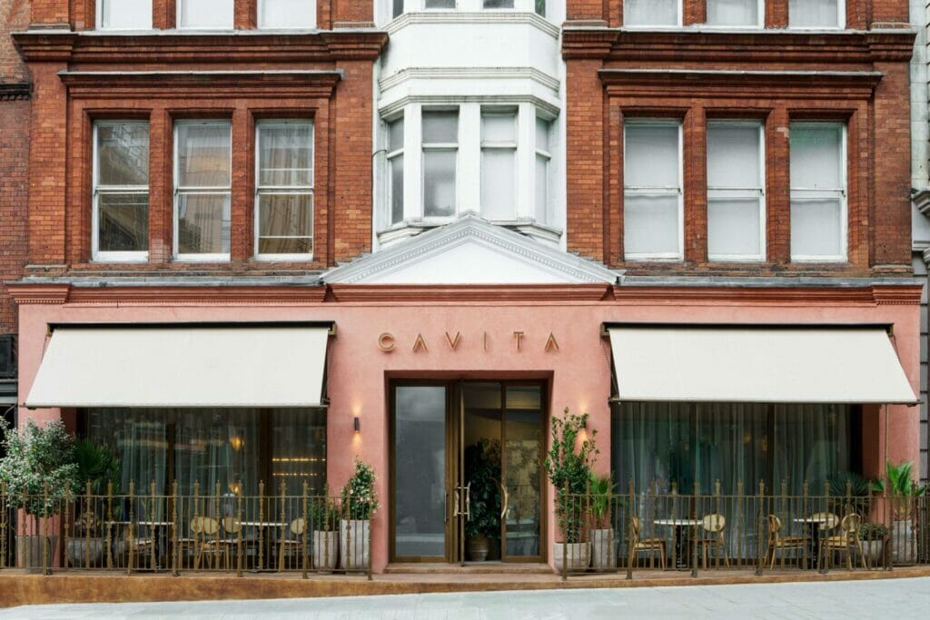
It was essential to me to select the right wall covering; it is what you are surrounded by the most, after all. It had to be of a natural material and somewhat rough, certainly textural, but it also had to be soothing and organic. I selected two suppliers – Ideal Work & Bauwerk – four different finishes and several colours for the frontage, ground floor, and basement. We had a labour challenge as some of these finishes were being done for the first time in the UK and the general worker shortage we all currently face. The result is just how I envisioned, though.
Finally, another critical aspect for me was the lighting plan. Similar to the wall covering, the lights play a fundamental role in how you feel in the space. We used the focal lighting to highly important features, but we also created a different atmosphere for each property area. The frontage should be welcoming and direct you to the restaurant entrance. Cavita’s lighting reproduces the sunshine coming through the leaves while sitting in a garden, whereas the basement has a candle-lit ambience, starting from the staircase.
This was an ambiguous project to me. The main challenge and joy were creating two opposite atmospheres within the same property. We had to use the materials and detail cleverly, so we could have a sense of harmony and unit in both the restaurant and mezcal bar while remaining true to their main characteristics. Whilst Cavita is the femininity and warmth, Mayahuel is masculine and fun, all the while being my first restaurant solo project.
I am proud to have designed something so personal to the owners, at the right level of refinement that the space required and also showcasing my sense of aesthetic and soulful design, all the while being my first solo restaurant design.
Key suppliers:
Granite table tops – https://www.rockandco.co.uk/
Terracotta tiles – https://artisansofdevizes.com/
Travertine tiles – https://www.authenticstone.co.uk/
Paint – https://www.bauwerkcolour.com/en/
Wall finishes – https://www.idealwork.com/
Accessories – https://www.nkuku.com/; https://reign-london.co.uk/ ; https://janeybutlercollections.co.uk/collections/accessories?page=4
Curtain fabrics – https://www.iliv.co.uk/
Second hand – https://millwards.co.uk/
Lighting – https://www.astrolighting.com/site-version
Terracotta bricks – https://www.terracottaworld.co.uk/
Bathrooms – https://www.victorianplumbing.co.uk/ https://www.crosswater.co.uk/toilets/toilets-and-cisterns/wall-hung
Hardwares – https://www.ironmongerydirect.co.uk/
Plants – https://www.conservatoryarchives.co.uk/
Camila Rodrigues, COR London

